E 26 |
ON design partners – Calling a Plan a Map |
type |
|
place |
|
date |
|
architect |
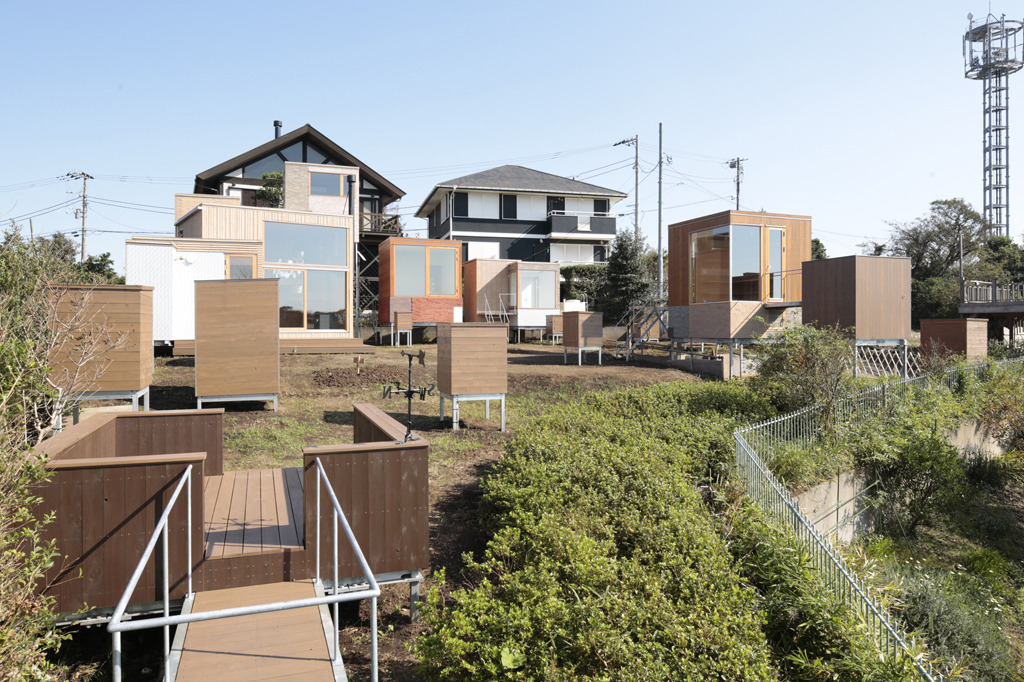
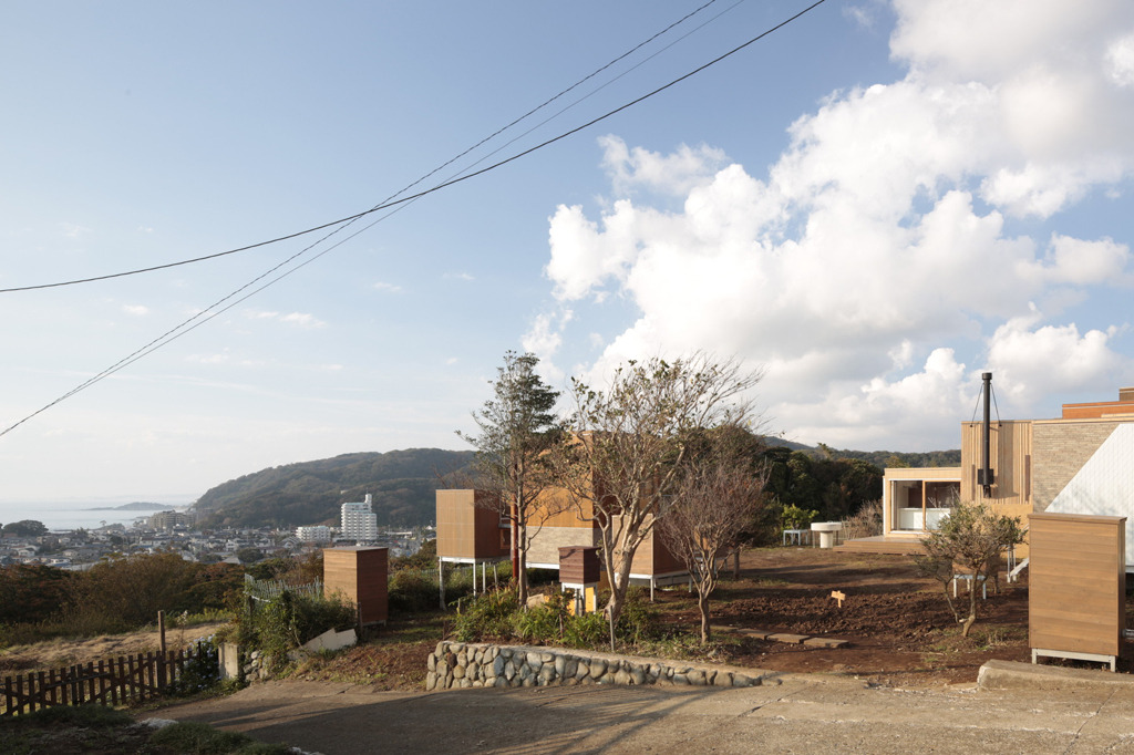
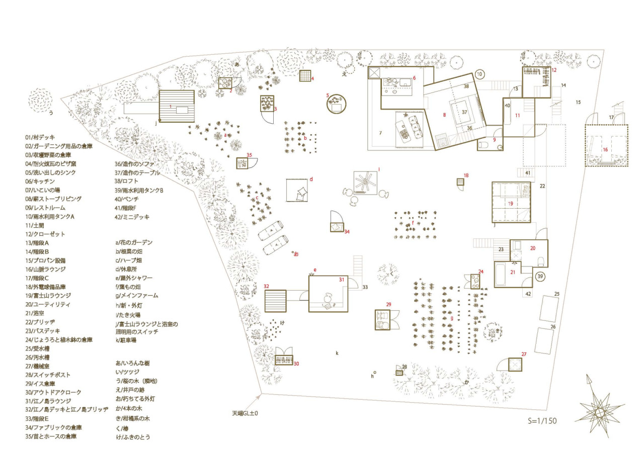
As there was plenty of space (on a 600 m² plot) the architects of this building decided to break this house up into its basic functional units. The scattered boxes on the site include places that people dwell inside, but there are others that cannot be entered, functioning only as a storage space, an outdoor kitchen sink or an electric switchboard. The collection of 22 free-standing units superficially resembles the display area of a DIY superstore, in the variety of their dimensions and surface coating but also form a kind of heterogeneous whole.
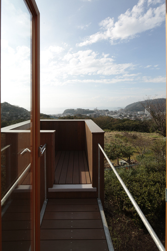
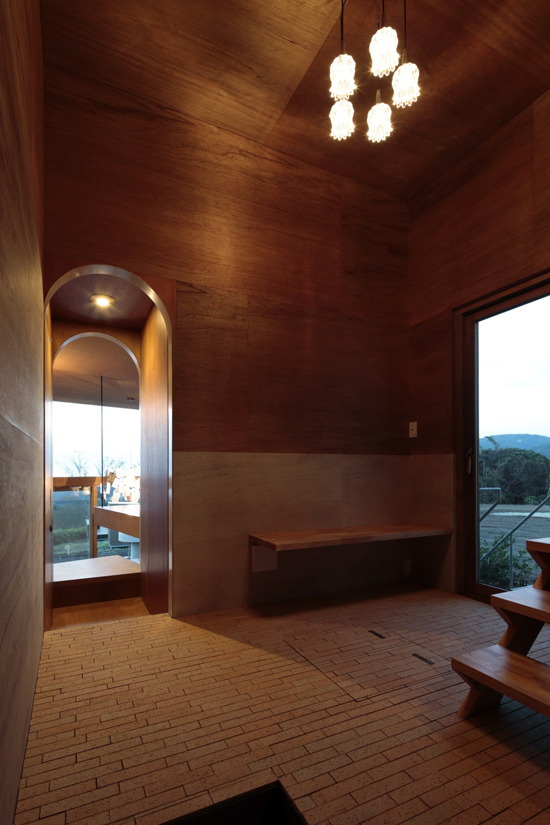
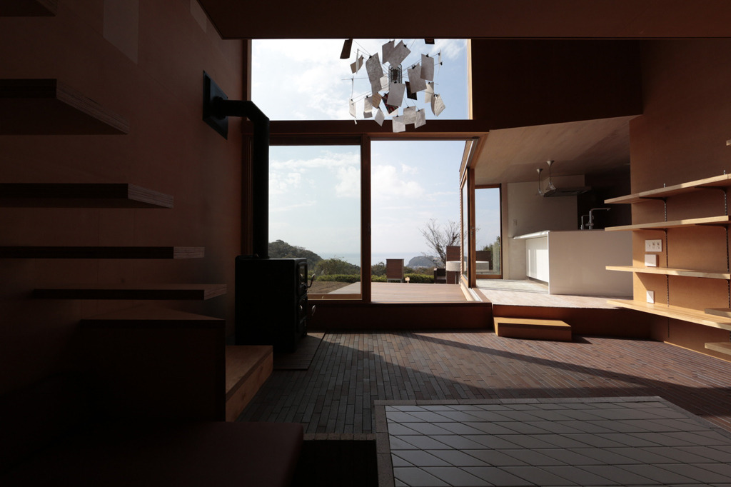
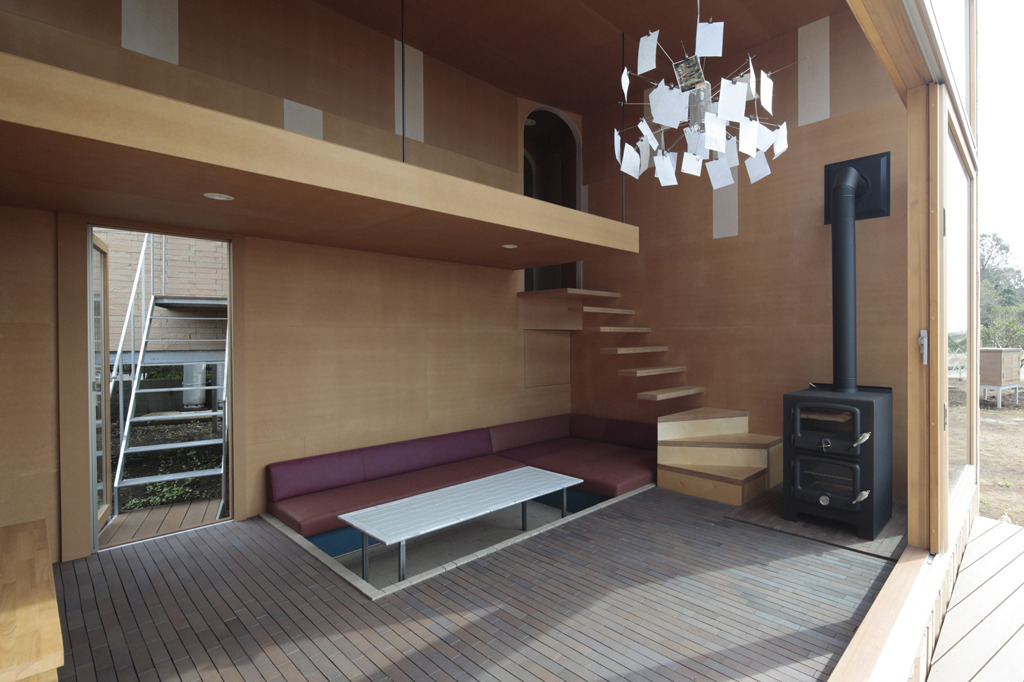
The central element of the ensemble is the two-story living/dining/kitchen area, from which there are outdoor access routes to the bedroom or the bathroom, so that the (in?)habitants can enjoy the view.
The various elements are linked by stairs and terraces. The dismemberment of the building means that its plan looks more like a map. Apart from the LDK block all the structures are temporary, without foundations and have lightweight steel frames. If the residents later decide that they want to the map can be redrawn and the elements re-arranged.
